
Table of Contents
- What is Dimension in data?
- Visualizing Sparsity Experiment
- Generalizing for N-Dimensional data
- Experiment Observation
- Conclusion
- Reference
To put it in simple words data behaves weirdly when we move to higher dimensions.
A thought triggered me while going through Model order reduction and clustering high dimensional data, the common theme of these problems is that when the dimensionality increases, the space increases so fast that the available data become sparse -Curse of dimensionality.
Keeping this point in mind I thought what will be the best way we can visualize and understand that sparsity is the curse.
What is Dimension in data?
In physics and mathematics, the dimension of a mathematical space (or object) is informally defined as the minimum number of coordinates needed to specify any point within it. Thus, a line has a dimension of one (1D) because only one coordinate is needed to specify a point on it – for example, the point at 5 on a number line. A surface, such as the boundary of a cylinder or sphere, has a dimension of two (2D) because two coordinates are needed to specify a point on it – for example, both a latitude and longitude are required to locate a point on the surface of a sphere. A two-dimensional Euclidean space is a two-dimensional space on the plane. The inside of a cube, a cylinder or a sphere is three-dimensional (3D) because three coordinates are needed to locate a point within these spaces.
Visualizing Sparsity Experiment
Random Data Generation
Here I have assumed few things
- I have randomly generated the data using the python package
random. Most of the distribution is close to continuous uniform distribution where, \(0 \le x_i \le 1\) and \(x_i \epsilon Q\), and \(x_i \epsilon [0,1]\). - I have made two groups of the randomly generated data
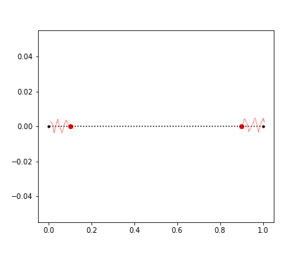
- Group 1(Red Zone): 10% of the data from the perimeter of the edge surfaces for 1D we are considering the last two point of the line i.e. 0 and
- Group 2(Blue Zone): It is the differential data from the first group
Some insight/information about the data distribution generated by the random function.
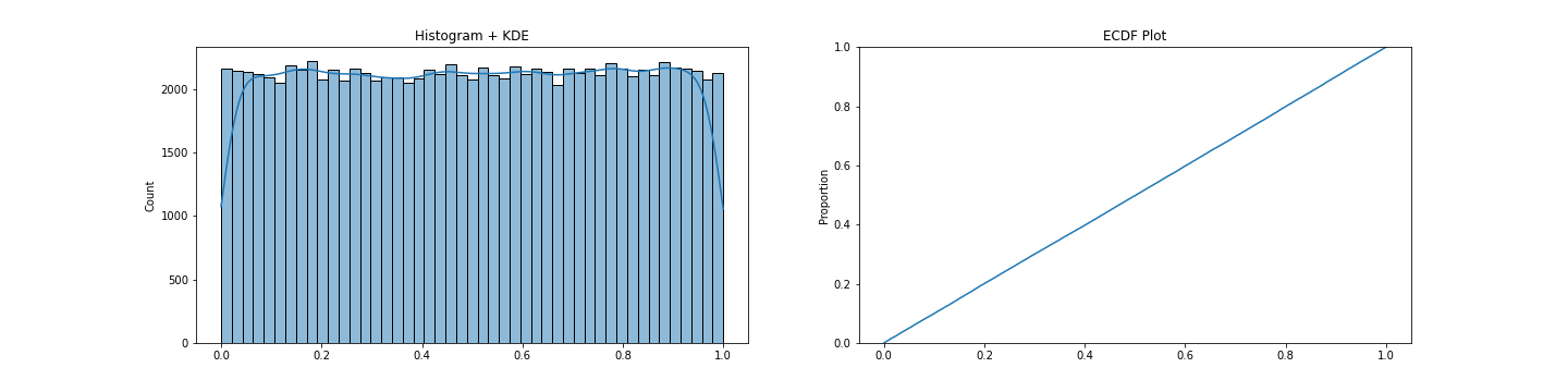
Seeing the above data we can call this close to an uniformly distributed data.
1-Dimensional data
As we have seen the data distribution above, it is clear that the random generator function returns uniformly distributed data points over the given space.
We will try to find out the 10% region from the edges first and compute the percentage of data falls inside the 10% Red zone from the edges.
Below is the code snippet to find the data which lies in the 10% region from the edges.
import random

one_d = [random.random() for _ in range(count)]

one_d_1 = [i for i in one_d if i < 0+perc]
one_d_9 = [i for i in one_d if i > 1.0-(perc)]

one_d_10 = list(set(one_d_1+one_d_9))
one_d_rest = list(tuple(set(one_d)-set(one_d_10)))
Now to visualize the data I have used the following code.
import matplotlib.pyplot as plt

for dat in one_d_10:
    plt.scatter(x=dat, y=val, marker=".", color='r')

for dat in one_d_rest:
    plt.scatter(x=dat, y=val, marker=".", color='b')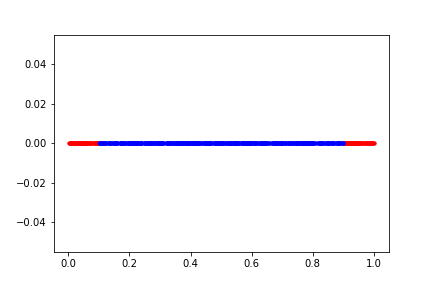
Some metrics for the above chart.
Total count of Data points: 1000
Percentage of Spacial volume from edges: 10%
Data in Red zone (10%): 203(Count); 20.3%(Percentage)
Data in Blue zone (Rest 10%): 797(Count); 79.7%(Percentage)
We can see for a line the percentage of data in the 10% spatial distance from the end point is around ~20% for 1000 random data points.
These numbers will more sense when we will go and calculate the same for higher dimensions.
2-Dimensional data
We will perform the same thing like 1D data to 2D data. For 1D we were considering the end points of the line. But, in case for 2D shapes we are considering the perimeter of the close surface, in this case it is a square.
We will try to find out the 10% region from the perimeter first, and compute the percentage of data falls inside the 10% zone from the perimeter of the square.
Below is the code snippet to find the data which lies in the 10% region from the perimeter of the square.
import random

two_d = [(random.random(),random.random()) for _ in range(count)]

two_d_r = [i for i in two_d if (i[0] > 1.0-perc)]
two_d_t = [i for i in two_d if (i[1] > 1.0-perc)]
two_d_l = [i for i in two_d if (i[0] < 0+perc)]
two_d_d = [i for i in two_d if (i[1] < 0+perc)]

two_d_10 = two_d_t+two_d_l+two_d_r+two_d_d

two_d_10 = list(set(two_d_10))
two_d_rest = list(tuple(set(two_d)-set(two_d_10)))
Now to visualize the data I have used the following code.
import matplotlib.pyplot as plt

for dat in two_d_10:
    plt.scatter(dat[0],dat[1], marker=".", color='r')

for dat in two_d_rest:
    plt.scatter(dat[0],dat[1], marker=".", color='b')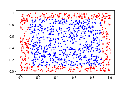
Some metrics for the above chart.
Total count of Data points: 1000
Percentage of Spacial volume from edges: 10%
Data in Red zone (10%): 367(Count); 36.7%(Percentage)
Data in Blue zone (Rest 10%): 633(Count); 63.3%(Percentage)
Now we see something interesting(a hypothesis). As we have increased the dimension from 1-D to 2-D we see a delta of +16.4 percentage points. This means that as the dimension is getting higher we see a trend of increase in density in the red zone.
We will try the same thing for 3-Dimensional and validate the above hypothesis.
3-Dimensional data
We will perform the same thing as 1D data and 2D data. For 1D we were considering the end points of the line, for 2D shapes we are considering the perimeter of the close surface, but for 3D we will consider the surfaces of the cube and take 10% spacial space from the limit of the surface.
import random

three_d = [(random.random(),random.random(), random.random()) for _ in range(count)]

three_d_r = [i for i in three_d if (i[0] > 1.0-perc)]
three_d_l = [i for i in three_d if (i[0] < 0+perc)]

three_d_b = [i for i in three_d if (i[1] > 1.0-perc)]
three_d_f = [i for i in three_d if (i[1] < 0+perc)]

three_d_t = [i for i in three_d if (i[2] > 1.0-perc)]
three_d_d = [i for i in three_d if (i[2] < 0+perc)]

three_d_10 = three_d_r+\
            three_d_l+\
            three_d_b+\
            three_d_f+\
            three_d_t+\
            three_d_d
three_d_10 = list(set(three_d_10))
three_d_rest = list(tuple(set(three_d)-set(three_d_10)))
Now to visualize the data I have used the following code.
import matplotlib.pyplot as plt
from mpl_toolkits import mplot3d

ax = plt.axes(projection='3d')

for dat in three_d_10:
    ax.scatter(dat[0],dat[1],dat[2], marker=".", color='r')

for dat in three_d_rest:
    ax.scatter(dat[0],dat[1],dat[2], marker=".", color='b')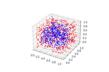
Percentage of Spacial volume from edges: 10%
Data in Red zone (10%): 512(Count); 51.2%(Percentage)
Data in Blue zone (Rest 10%): 488(Count); 48.8%(Percentage)
This became interesting. We can confirm our hypothesis seeing the 3-Dimensional data. In this case we can see another increase of delta +14.5 percentage points. This shows that there is an increase in density in the red zone compared to the smaller dimension.
We can see that as the dimension grows there is a tendency that the volume of the data in the 10% spacial volume from the surface i.e. red zone will increase if this goes on till infinite dimensional hypercube then most of the data will be at the surface of the defined space.
Generalizing for N-Dimensional data
As we observed from 1D, 2D and 3D array we can generalize that for multidimensional array, and we use the code bellow.
import random

count = 10000
n_dim = 30

n_d = [tuple(random.random() for x in range(n_dim)) for x in range(count)]


def n_dim_count(n_d):
    n_dim = n_d[0].__len__()
    n_d_10 = []

    for dim in range(n_dim):
        n_d_f1 = [i for i in n_d if (i[dim] > 1.0-perc)]
        n_d_f2 = [i for i in n_d if (i[dim] < 0+perc)]

        n_d_10 = n_d_10 + n_d_f1 + n_d_f2

    n_d_10 = list(set(n_d_10))
    n_d_rest = list(tuple(set(n_d)-set(n_d_10)))

    return len(n_d_10), len(n_d_rest), len(n_d_10)/count*100, len(n_d_rest)/count*100
Sorry, I am not capable enough to provide a visualization for 30-Dimensional data. ;)
Here, we will do something interesting and try to find the same percentages we did for 1D, 2D and 3D for rest vs multiple distribution of percentage of spacial volume from the edge
# Range of percentage like 1%,2%,..., 10% for the spacial volume from the edge
percs = [0.01,0.02,0.03,0.04,0.05,0.06,0.07,0.08,0.09,0.1]

# This list stores the count of random data generated and will be used in n-Dimension
counts = [10**x for x in range(1,7)]

# List will store the range of dimensions we will run the experiment on
n_dims = [x for x in range(1,50+1)]

# This is the code for generating the `n_dimensional` data with `count` of random data
n_d = [tuple(random.random() for x in range(n_dim)) for x in range(count)]
We will look at some visualizations generated by the above code and analyze for different percentages of spacial volume from edge/perimeter, dimension of the data and count of random data points.
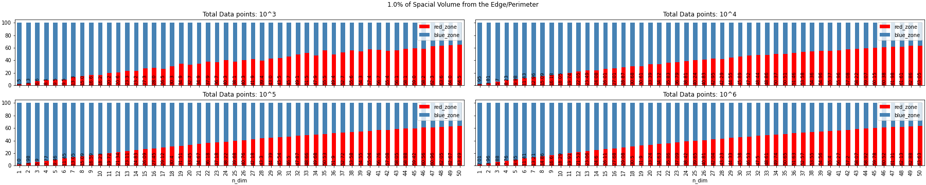
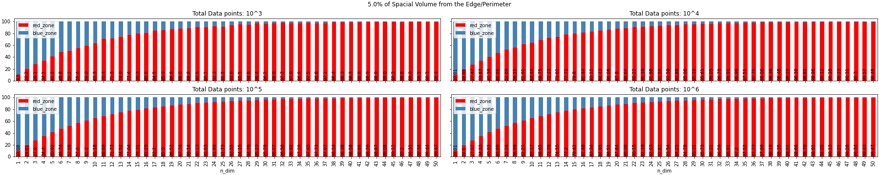
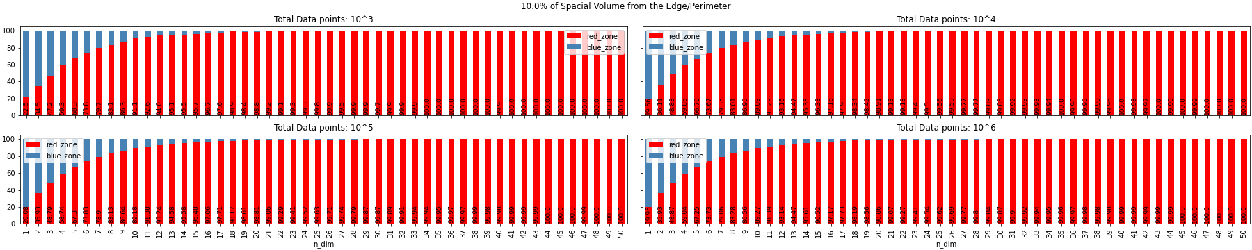
Experiment Observation
- As the Dimension tends to infinity the randomly generated samples go to the limit of the space defined. In the above example it was a hypercube, but it can be N-sphere, any n-dimensional platonic solids, n-polytope or it can be any closed figure with boundary limits(a per my knowledge)
- Example: If we have a hyper-sphere all the data point will be on the surface
- As we have more dimensions, a data point have more chance to become unique to the next data point as it will have another space to represent its characteristics this leads to the sparsity
- Example: {Data ranges from (0,1) with 0.05 step} If we have two data points like (0.5, 0.5) and (0.5, 0.55) then the separation between two data points is very minimal. Now, if we add another dimension then we will have another 20(for data point 1)+20(for second data point) different points.
- The volume of data points does not have a huge effect in the distribution of the red zone and the blue zone for all different dimension i.e. volume of the data does not have an effect on the sparsity of the data and movement of the data to the surface of the hypercube.
- From the above image we can see for 1% of the spacial volume from the surface, the data takes more dimension to get to the surface
We can conclude that sparsity is a curse than a blessing.
Conclusion
This is true that data behaves uniquely and weirdly in high dimensional space.
Most of the Experiment Observation are the conclusion of the blog as well.
Apart from this I feel I will explore further on the following items in the future:
- How does distance based model behave in high dimensional space?
- What kind of model is best to work with when data points are on the surface of the n-D space?
Reference
1) https://en.wikipedia.org/wiki/Clustering_high-dimensional_data
2) https://towardsdatascience.com/the-curse-of-dimensionality-50dc6e49aa1e
3) https://deepai.org/machine-learning-glossary-and-terms/curse-of-dimensionality
4) https://blog.dominodatalab.com/the-curse-of-dimensionality
5) https://www.statistics.com/19394-2/
6) https://radiopaedia.org/articles/curse-of-dimensionality-1